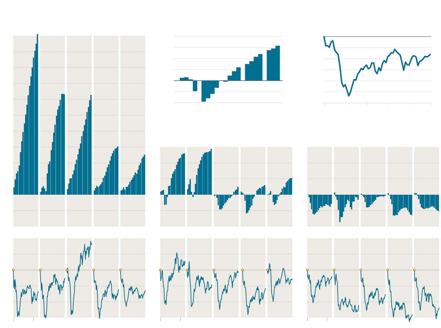
NYT Chart GDP, stock markets for key countries 2008-2012
Super chart from NYT about GDP, stock markets for key countries between 2008-2012. Following points of interest:
Remarkable correlation between markets with different GDP movements. To me that points to singularity in source of money pushing the markets.
Indonesian markets are substantially bullish. Someone must have made a ton of money there. Conversely, it signals time ripe for reversion.
Britain stands out among those countries with declining or negative GDP and stands with US and Germany rather than Japan, Italy or Spain. Again remarkable correlation between Italy and Spain surprised that there is no time difference in the moves since their economic future will not be as coincidently timed as their markets.

Buy my books "Subverting Capitalism & Democracy" and "Understanding Firms".


